


At a glance
Quick summary
- Use just two fonts
- Use fonts with lots of styles
- Use Google Fonts
1 // Not picking fonts with enough styles
Of the font mistakes, this is the biggest one. And, it’s often the most overlooked.
Font styles are the variations of the font. They include normal, bold, italic, and bold italic.
Some fonts include only one style. Some, like Roboto (pictured below), come with many.
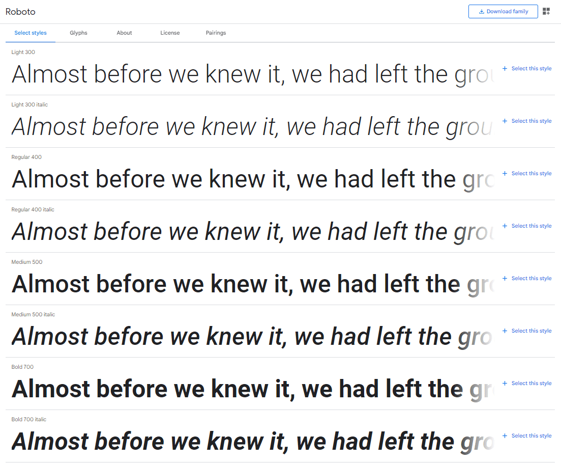
The mistake that Entrepreneurs make is selecting fonts for their website with too few styles.
If you do, you can run into annoying design problems. Things like not being able to bold your headings enough, or having body text that’s too dark.
It’s worth noting here that your web fonts do not have to be the exact same font(s) used in your logo.
As long as the fonts chosen for your site are consistent with your brand, it’s perfectly acceptable to choose
Recommendation: For web, stick with Google Fonts, and select fonts with at least six styles, but the more styles the better.
2 // Font size is too small
This is one of the font mistakes that happens most often on mobile.
In almost all cases, the minimum size you should use is 16px. This is true across all screen sizes.
If you go much smaller than that, you could be preventing your visitors from reading your content.
And, worse still, you could be running into issues with accessibility.
Recommendation: Your minimum font size, across all screens, should be 16px.
3 // Font is illegible
I’m looking at the wedding professionals here!
I work with lots of wedding planners, florists, photographers, etc., and all too often, their sites are loaded with terrible script fonts.
Script fonts, also referred to as handwriting fonts, are fraught with legibility issues:
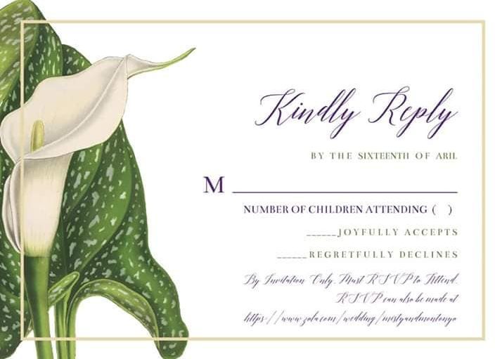
This invitation design makes me cringe.
There’s no way anyone is able to read the RSVP information, particularly that URL.
Recommendation: Avoid script fonts whenever possible. If you must use a script font, ensure that it’s legible at all times.
4 // Using more than two fonts
For most websites, two fonts is the most you’ll need: One for headings, and one for body text.
Occasionally, a third font can be included for minimal accents throughout. Here’s an example from a site I’m designing:

You’ll notice the heading and body fonts are there. Plus, I have a script font which serves as an accent above the heading. (This was done at the request of my client.)
Beyond minor exceptions like this, you should stick to just two fonts.
Recommendation: Utilize just two fonts, one for headings, and another for body text.
5 // Using cliché fonts
Comic Sans.
Papyrus.
Curlz Mt.
Bradley Hand ITC.
Impact.
These, plus a few others, are all on the list of terrible, cliché fonts. The first two in particular.
Almost universally, there is no reason to use any of these fonts.
Here’s a full list of terrible fonts to avoid, in case you’d like to see some others.
(I have heard an argument made that Comic Sans is good for folks with dyslexia. If that’s true, then there may be a reason to use it as your body font. However, I would say that there are likely other, less cliché fonts that’re also good for folks with dyslexia from which to choose.)
Recommendation: Avoid cliché fonts, especially Comic Sans and Papyrus.
6 // Using unlicensed fonts
If you’re using a font outside of a typical library that comes with your tools, chances are that font requires a paid license.
For graphic design, purchasing fonts can be quite helpful in achieving the look you want.
For web design though, I find it best to avoid.
The best option I’ve found, both for ease of use and for avoiding licensing issues, is to use fonts from the Google Fonts library.
The library is vast, it’s growing, it’s free, and it’s searchable (including by number of styles, which helps immensely with item #1 above).
Recommendation: For web design, use Google Fonts.
Keep reading
Curious about more web design faux pas?
If you’re making any of these web design mistakes, you’re committing High Crimes against the online community, and your business will be punished.
Others? Questions?
Have questions? Itching to point out something I forgot?


0 Comments