At a glance
Quick summary
- Guide: Below is a step-by-step guide that’ll help you choose website colors
- Free tools: We’ll use Pinterest and Coolors to make the final Color Palette — both free tools
Which colors should your Palette have?
It’s not an exact science when you choose website colors.
However, I do recommend starting out with a five-swatch Palette made up of the following colors:
- Primary: The main color you’ll use
- Shade of Primary: A slightly lighter or darker shade of your Primary color
- Accent: A complimentary color. Used for links, Calls to Action, etc.
- Neutral Light: Usually white or a shade of white. Used for backgrounds, light text, etc.
- Neutral Dark: Usually black, charcoal, (very) dark blue, or a shade of one of these. Used for backgrounds, dark text, etc.
Courage & Grow’s five-shade Palette
For an example, here’s the palette I’ve identified for Courage & Grow:

| COLOR TYPE | COLOR NAME | SWATCH & HEX |
|---|---|---|
| Primary | Indigo Dye |  004678 004678 |
| Shade of Primary | Maximum Blue |  5DB2C9 5DB2C9 |
| Accent | Red Pigment |  EA3327 EA3327 |
| Neutral Dark | Jet |  333333 333333 |
| Neutral Light | Baby Powder |  F7F8F3 F7F8F3 |
If you’re curious about how I got the Color Names and HEX Codes, I’ll show you later on in the post!
Choose website colors with these 5 steps
Let’s talk about how to choose website colors! This is a step-by-step method that makes identifying a color palette effortless.
1. Select a Primary Color
Choose Website Colors — Step 1 of 5
Your Primary Color is the main color you’ll use in your Palette when you choose website colors.
For example, Courage & Grow’s Color Palette is pretty extensive — it includes rainbow colors — but the Primary Color is blue. Specifically, a shade of blue called Indigo Dye.
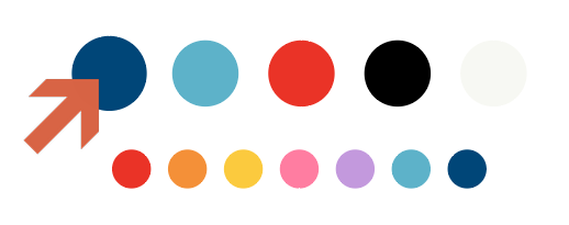
If you browse around the site, you’ll see all of these colors represented, but that blue is easily the most prominent. The rest are accent colors.
If you already know what color you’d like as your Primary Color, great! Skip to the next Step.
If you want a little bit of help picking one out, try this:
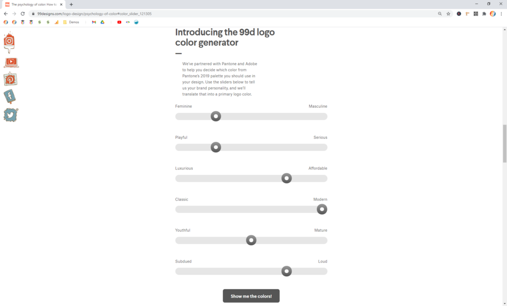
Step 1.1 — Head to the 99d Logo Color Generator
99Designs has a tool called the Logo Color Generator. It’s located on a post of theirs called The Psychology of Color: How to Choose the Right Logo Color.
Click here to jump to that Generator.
Note
That link should take you to the right section. But, if you end up at the top of the post, scroll down about halfway to find the Generator.
Step 1.2 — Drag the sliders to match your Brand’s personality
Step 1.3 — Decide if the suggested color makes sense
Once you click Show me the colors, 99Designs will spit out a suggested color.
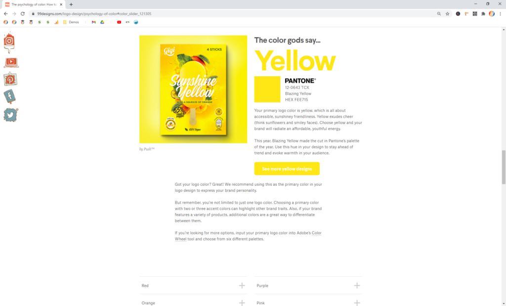
You can either take this color and run with it. Or, you can make some adjustments and try again.
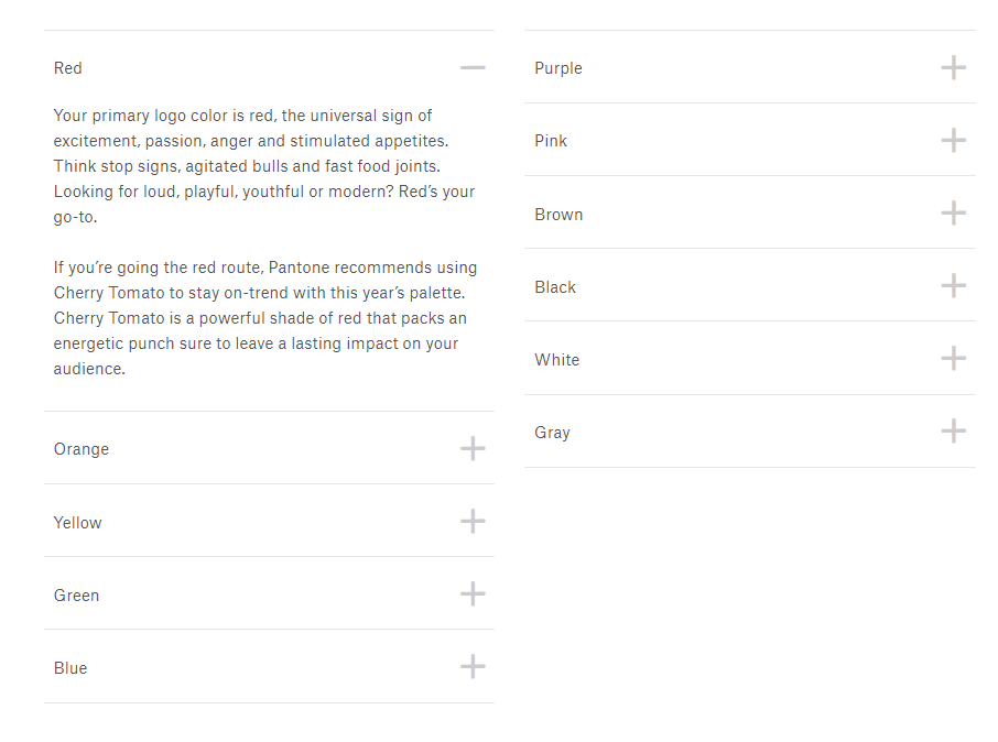
Also, you can scroll down to the list of colors and read their descriptions. If one of these stands out, you can pick that color!
Note
You don’t have to decide on a specific shade just yet. Selecting a general color like pink or yellow or blue is enough for now.
2. Create a Color Inspiration Board on Pinterest
Choose Website Colors // Step 2 of 5
Once you’ve got a general idea of your Primary Color, it’s time to head over to Pinterest.
Pinterest is, by far, the most effective tool I’ve found for researching Color Palettes and in helping you choose website colors. There are endless examples, and they’re super easy to browse and save.
The goal is to create a Board full of Pins featuring your Primary Color.
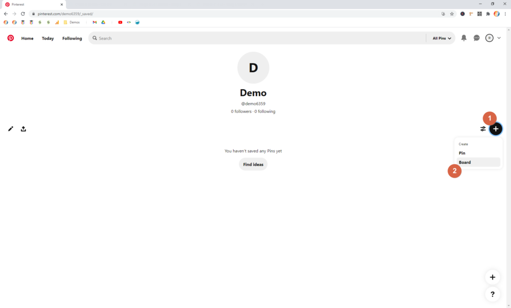
Step 2.1 — Go to your Boards on Pinterest
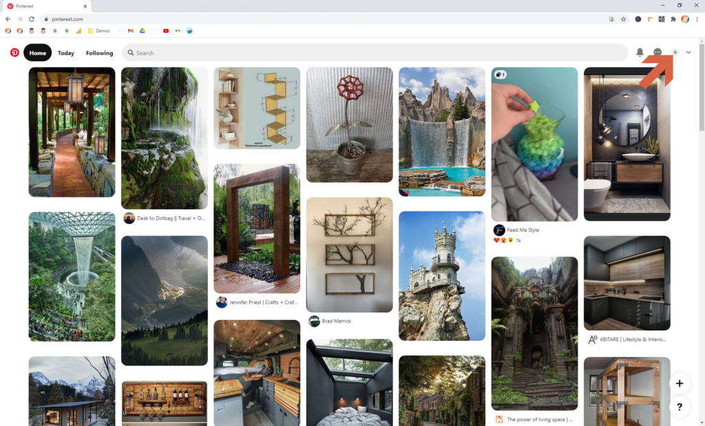
Log into Pinterest. If you don’t have an account, you’ll need to create one.
Once there, click on your profile icon in the upper-right corner.
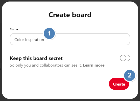
Step 2.2 — Create a new Board
3. Save at least 30-50 Pins to the Board
Choose Website Colors // Step 3 of 5
Now it’s time to start adding Pins to the Board:
Step 3.1 — Add Pins to your new Board
All you have to do is search Pinterest for {primary-color} color palettes, where you substitute {primary-color} for the color you identified in Step 1.
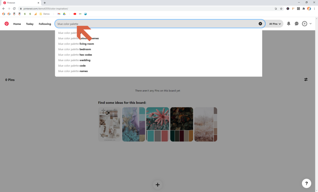
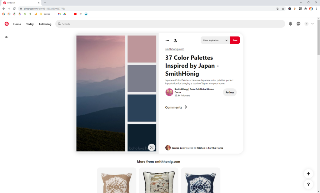
Then, when you find a Pin that you like, Save it to the Board you just created.
Make sure Color Inspiration (or whatever you named the Board) shows up in the dropdown. Then click Save.
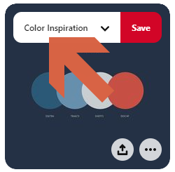
I recommend adding at least 30-50 Pins that you like and that might work for your brand.
Step 3.2 — Save a mix of Palette, Room, and Web Pins
I recommend saving a blend of three different types of Pins: Color Palettes, Room Designs, and Web Designs.
Having a blend like this will ultimately help you choose website colors that make sense. And they give you different perspectives on your final palette.
Also, if you follow this method, you’ll identify one Pin from each category for your Top 3.
Note
For help finding these types of Pins, see the Try different Keywords strategy below
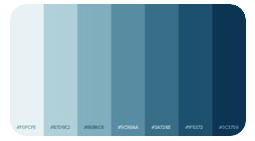
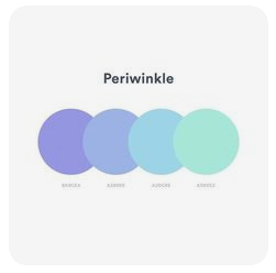
Color Palette Pins: Pins that have Color Palettes, color schemes, and/or swatches with your Primary Color.
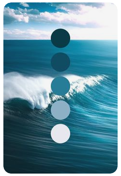
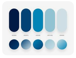
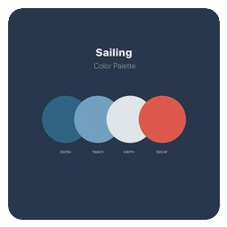
Room Design Pins: Pins that show interior designs featuring your Primary Color.
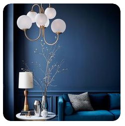
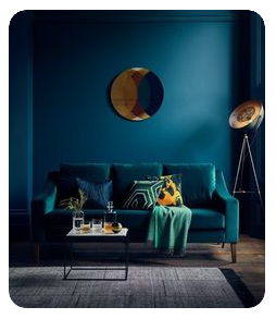
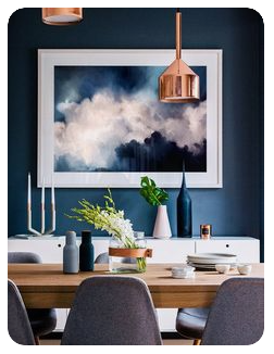
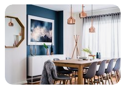
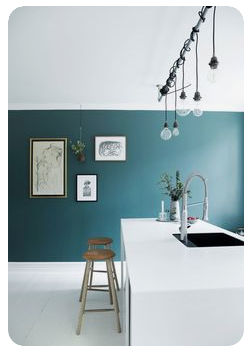
Web Design Pins: Pins that show web pages that feature your Primary Color.
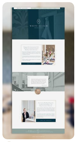
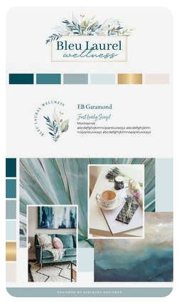


I recommend saving at least 10 from each category.
Strategies for finding more Pins
Here are some ideas for finding additional Pins that help you choose website colors:
Strategy 1 — Try different Keywords
Find more Pins by searching for a variety of different keywords.
Note
Not all searches have to be specific to Color Palettes! Inspiration can be found all over.
- {primary-color} color palette
- {primary-color} color scheme(s)
- {primary-color} web/website design
- {primary-color} websites
- {primary-color} interior design
- {primary-color} room design
- {primary-color} mood board
- {primary-color} color inspiration
- {primary-color} inspiration
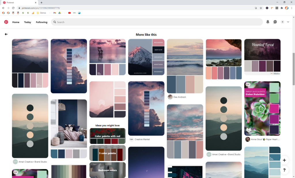
Strategy 2 — Browse related Pins
Strategy 3 — Browse More ideas from your Board
Once you have 5-10 Pins on your Board, you can use the More ideas feature to help you find new Pins.
Head over to the Board you’ve been building. First, click your profile icon.

Then, click into your Board.
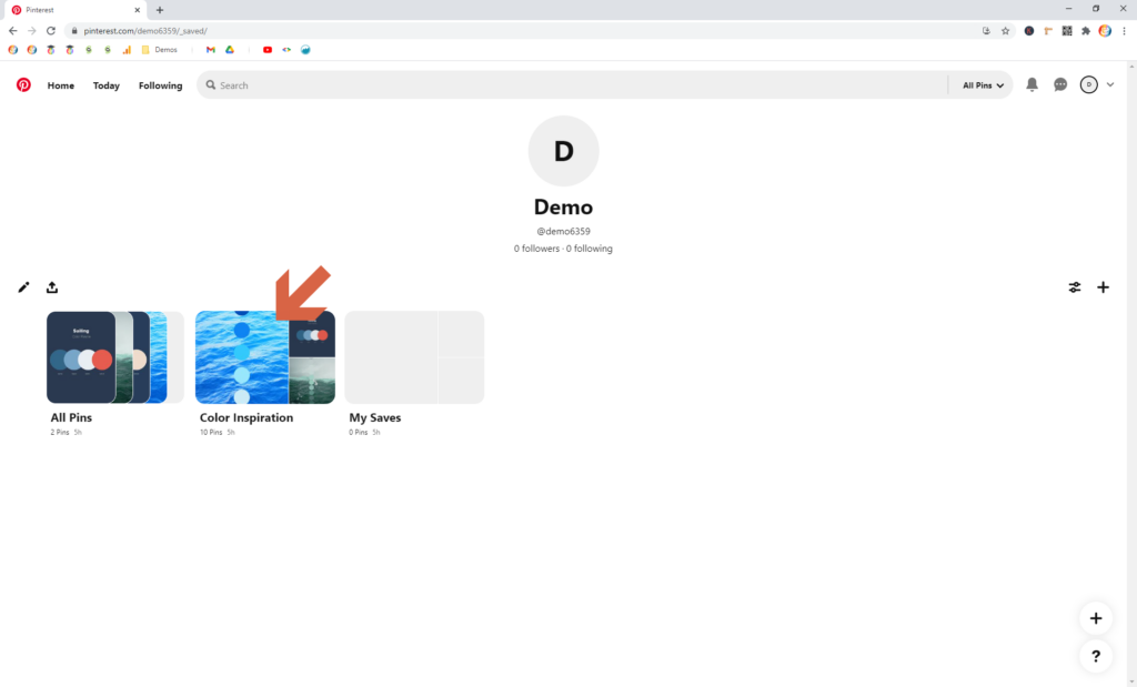
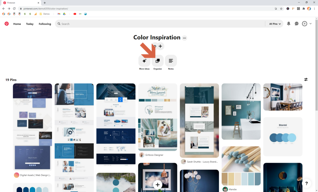
Finally, click the More ideas button
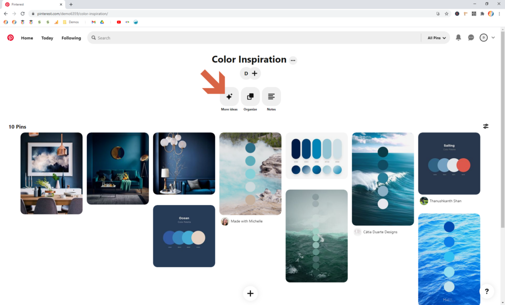
You’ll be given a bunch of new options that are similar to the Pins already on your Board.
Note
You’re not given the option to select a different Board from this view. Every Pin you save here will automatically go to the Board you chose initially.
Strategy 4 — Refine your Primary Color’s name
Try replacing your Primary Color’s name with another shade, or add an adjective to make it more specific.
Here are some examples for blue:
- Sapphire
- Slate
- Navy
- Indigo blue
- Cobalt blue
- Light blue
- Ocean blue
You can also search Pinterest for shades of {color} to get some ideas for more color names!
4. Create a Top 3 section within your board
Choose Website Colors // Step 4 of 5
Once you’ve got 30-50 Pins on your Board, it’s time to comb through it and pick your favorites.
I recommend narrowing this list down to a Top 3.
Step 4.1 — Create a section within your Board
Step 4.2 — Select a top Color, Room, and Web Pin
Now, comb through your Board and identify the one Pin from each category that best represents your Brand.
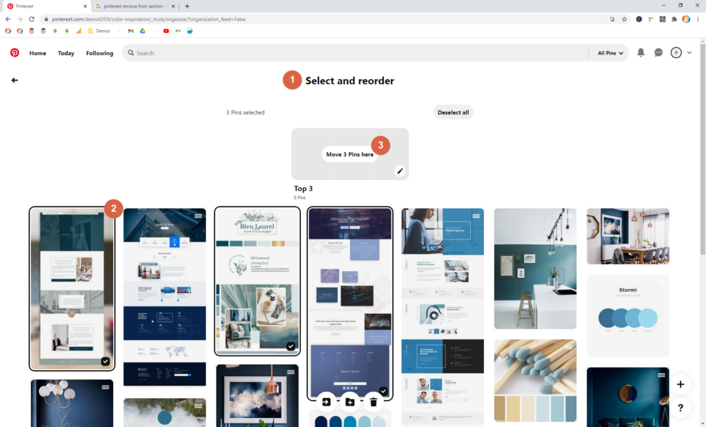
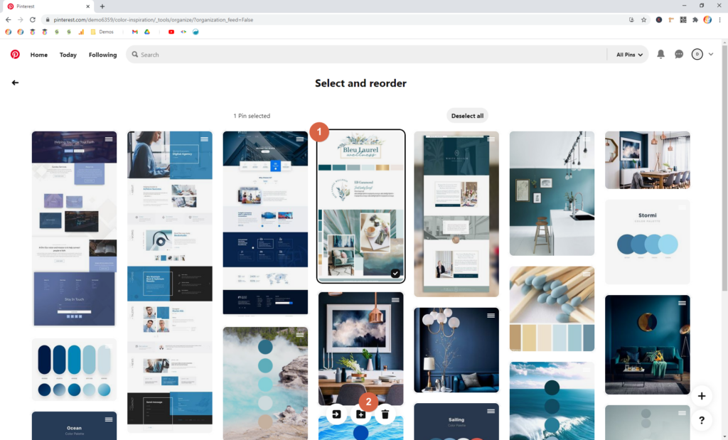
To add Pins to a section you’ve already started, be sure you’re on the Select and reorder page (by clicking Organize on the main Board).
Then, click the Pins you want to add.
Finally, hover over the section, and click Move Pins Here.
5. Build your Color Palette using Coolors
Choose Website Colors // Step 5 of 5
The last step as you choose website colors is to put together a formal Color Palette.
Don’t panic though! This is super simple, and free, using an awesome tool called Coolors.
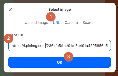
Step 5.1 — Get the Image Address for your top Pin
Before jumping to Coolors, head to your Pinterest Board and select the one Pin that will serve as your start point as you choose website colors.
To start, I recommend choosing the Color Palette Pin you selected for your Top 3.
Click that Pin to expand it.
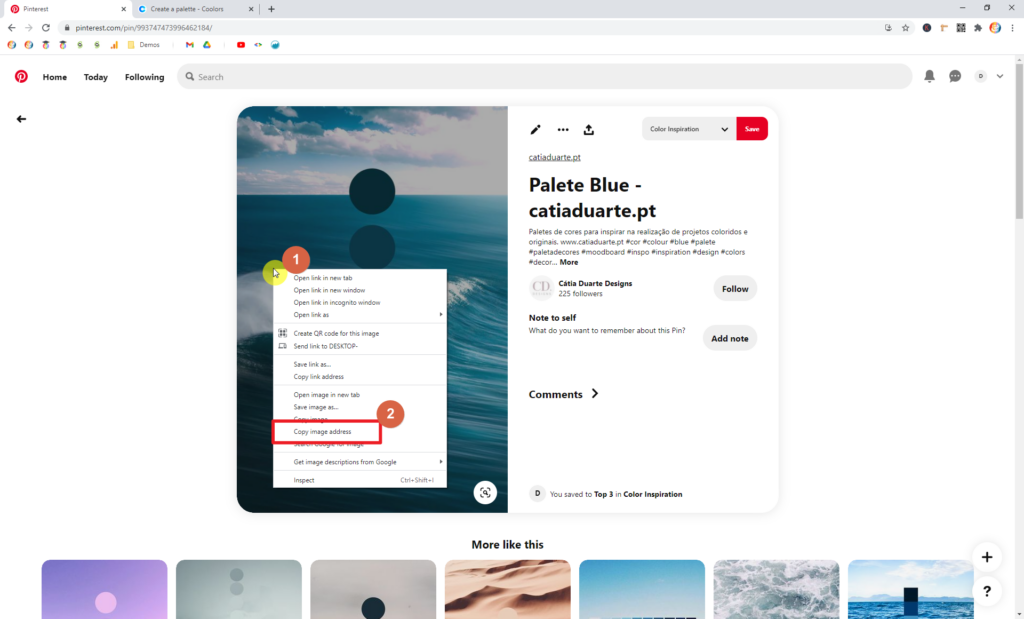
Then, right-click (Windows) or control-click (Mac) on the image.
A context menu will appear. From there, choose Copy image address.
Note
In the screenshot below, I’m using Chrome. If you’re using a different browser, your menu might look a bit different. And, if you’re using Firefox, your option will say Copy image location (instead of ‘address’).
Caution
Be careful to select Copy image address (NOT Copy link address).
Step 5.2 — Create a Coolors account
I highly recommend creating an account with Coolors. It’s free, and it’ll enable you to save your Palette for future use.
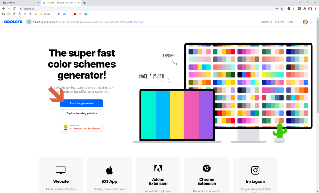
Click here to head over to Coolors.
Sign up for an account using the Sign up button in the upper-right corner.
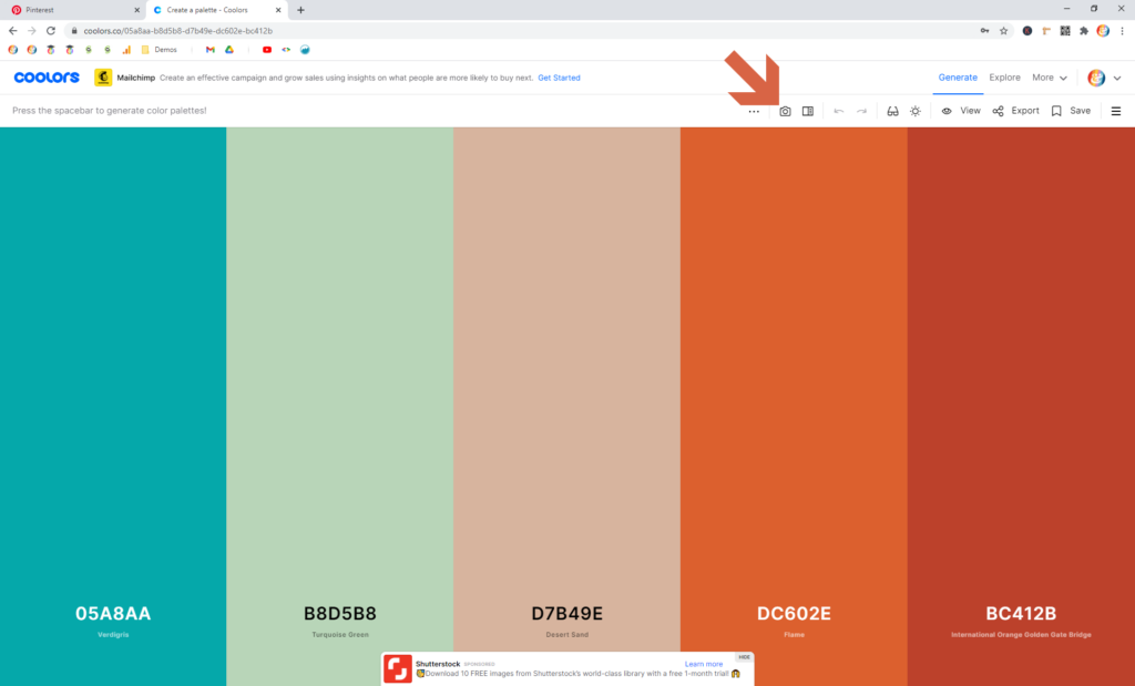
Step 5.3 — Head to the generator
Step 5.4 — Create a Palette from the photo
Step 5.5 — Identify your five colors
If you need, review my guidelines for a five-swatch Color Palette from above.
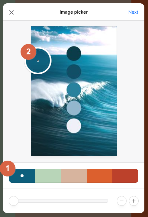
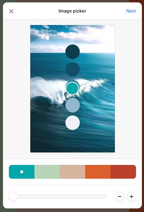
When you make it to the Image picker, Coolors should default to five swatches, which is perfect!
Now, click on the first swatch (the far left one). Then, click anywhere in the image to select that color.
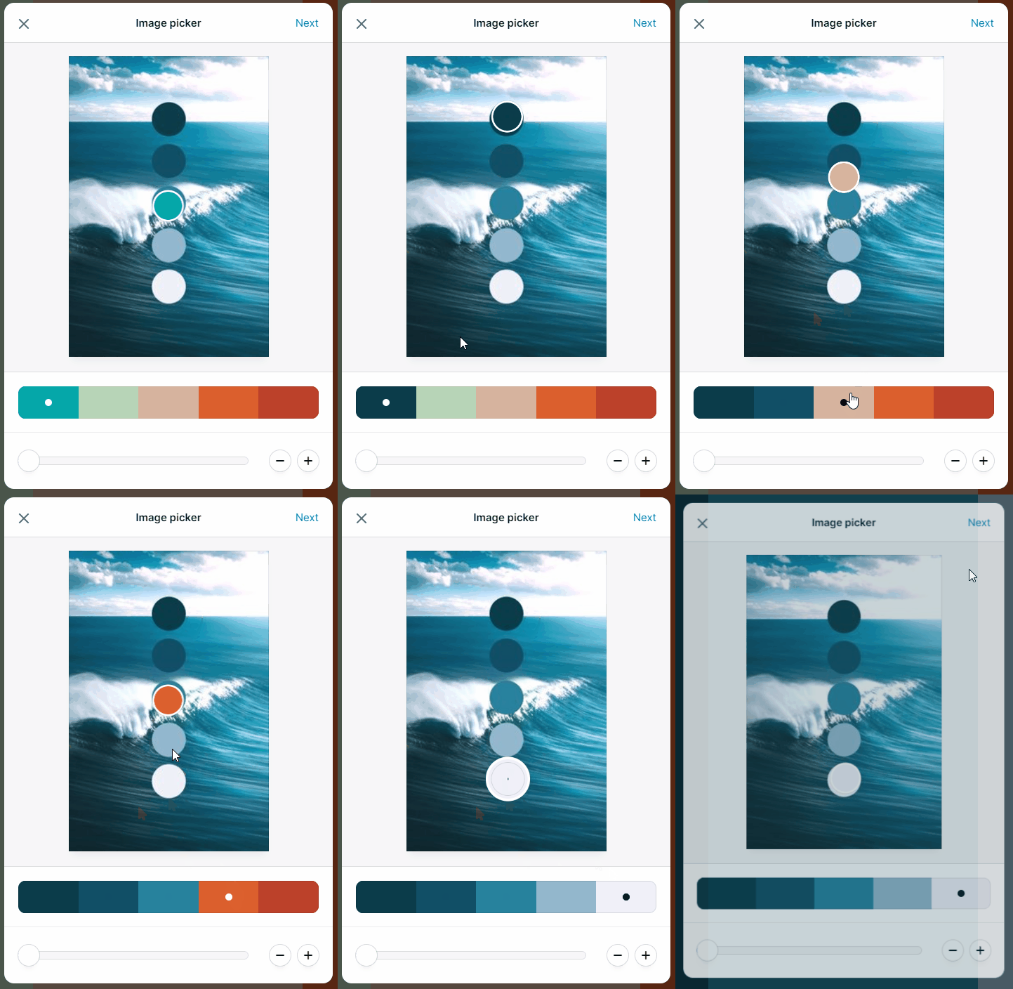
Repeat this process for each of the five swatches. Then click Next, and then Open in the generator.
Pro Tip
If you use a Color Palette Pin as recommended, use those swatches in the image to pick your swatches! (As I did in the animation above.)
Here’s the final output in the generator:
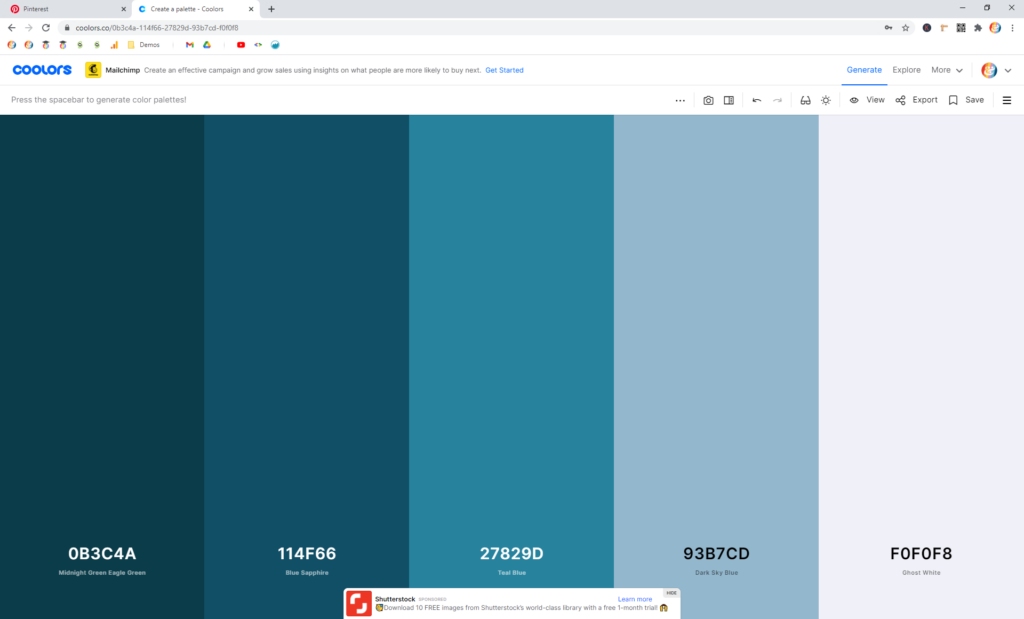
Step 5.6 — Tweak your Palette
The last step is to tweak your Palette to get it to line up with the color types I recommended at the top of this post.
In the Pallete I have here, I’d make the following adjustments:
Select an Alternate color: I need an Alternate color, one that contrasts with the Primary color. This color is used to draw attention for links and buttons, so you want it to go with the Primary, but you also want it to stand apart.
This is where your Top 3 Pins come in handy. I flipped over to my Web Design Pin, and spotted this bright blue:

So, to grab this color, repeat Steps 5.1, 5.4, and 5.5 above, and identify just that one color. (You can just adjust the first swatch and leave the other four alone.)
BUT! This time, don’t choose Open in the generator. Instead choose View Palette.
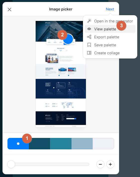
Then hover over the HEX item and choose Click to copy. Finally, close the dialog using the X.
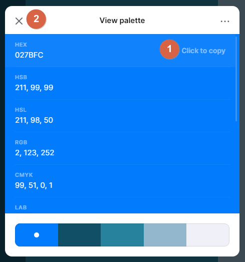
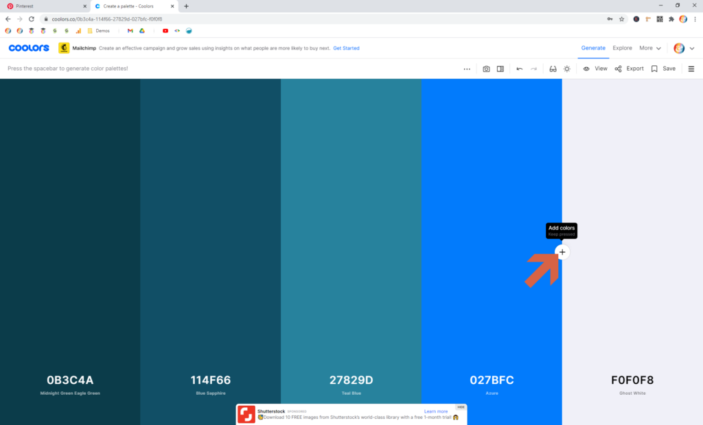
Now you have to decide whether to overwrite one of your existing colors, or add this as a new color.
For this example, I really like the first three shades. So, I’m going to keep them (and make this a six-shade Palette instead of five).
But, I’m not crazy about Dark Sky Blue, so I’ll overwrite that one.
To do so, click the HEX code and paste in the one you just copied.
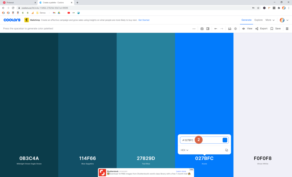
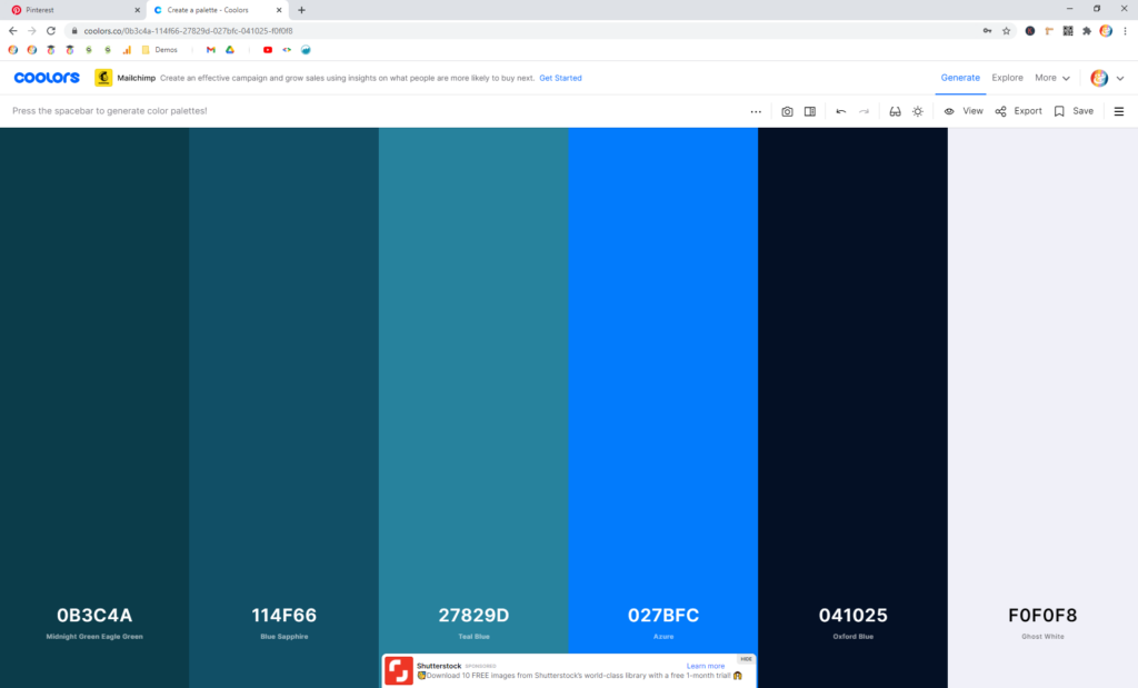
Add a Neutral Dark: Finally, because I like the Ghost White for my Neutral Light, I just need to add a Neutral Dark — a black, charcoal, or (very) dark blue color.
Simply repeat the process above. But, this time, add a swatch by hovering between two colors and clicking the + icon.
Paste in your new HEX code, and your Palette is ready!
Step 5.7 — Save your Palette in Coolors
Because you created an account, you can save your palette!
Click the ![]() icon in the toolbar. Give it a name, and click Save.
icon in the toolbar. Give it a name, and click Save.
Need help? Leave a comment!
If you get stuck following these instructions, give me a shout in the comments below. I will try my best to help guide you!
Or, if the question is bigger than the scope of the comments section, we can chat one-on-one. In this case, head over to the Contact page and drop me a note!





0 Comments