


- Your site should avoid, at all costs, making visitors do any extra work
- If we’re doing work while on your site, you’re losing traffic and sales
- There are 7 major areas where I see Entrepreneurs make web design mistakes. I cover those below.
Are you making these web design mistakes?
I actually call these web design mistakes the 7 High Crimes of Web Design, but that’s not a very good keyword for SEO. (Would you have searched that in Google?)
Whatever you call them, they’re an affront to all that is good.

In all seriousness though, making any of these web design mistakes could be costing you business.
Why?
It all boils down to just one question…
Does your site make us do work?
Work in the form of waiting.
Or feeling frustrated or annoyed.
Or having to search and search.
Or excessively read.
Or navigate around broken crap.
If we have to do extra work, we are significantly less likely to buy.
This all stems from a concept called Cognitive Fluency, or the brain’s preference for things that are familiar and easy to understand. (Source: CXL)
Simple sells
An incredible CXL article called Why Simple Website Designs are Scientifically Better covers this in detail.
To save time, I’ve summarized it in three key points:
- Our brains prefer things that are easy to think about
- A study by Google found that the simpler the site design, the better
- People have basic expectations about websites, and we should meet them
Ultimately, preventing any of us from doing extra work while on your site should be your highest priority.
If it’s not, you’re losing traffic and sales.
So, what kinds of things should you be avoiding? Let’s take a look.
The 7 High Crimes of Web Design
Here are the seven web design mistakes that I see over and over and over.
And over.
And over. ?
Your site makes us wait
Web Design Mistakes // 1 of 7
2.5 seconds.
That’s the target that Google wants us hit across all pages on our websites (Source: Web.dev).
Admittedly, this is a tricky mark to hit, especially for Entrepreneurs and folks just starting out. But, this is the direction the web is heading.
And seeing as Google is still the dominant search engine, they get to call the shots.
People don’t wait around
They have good reason though: People just don’t wait around for sites to load. After three seconds, traffic takes a nosedive.
But, striving for 2.5 second load times and coming in a bit short isn’t one of the web design mistakes here.
It’s folks whose pages take five seconds. 10 seconds. 15 seconds. Even 20 or more seconds to load.
Remember my not-dramatic, actual-footage-of-me-not-Eva-Longoria gif from the top of this post? Insert here, please.
Factors that contribute to long load times
There quite a few things that can impact the load time of a page.
If you’ve committed this High Crime, look through this list and see if you made any of these web design mistakes:
1. Poor hosting: Hosting is the foundation of your entire site. If the foundation is garbage, everything else will be too. I’d start here.
If you’re considering a switch, or are just starting out, I highly recommend checking out SiteGround. Or, if you want more info, read my post on it!
2. Images aren’t optimized: This is one of the most common web design mistakes I see. Folks upload massive images to their, especially to blog posts, and they take forever for visitors’ browsers to download. You need to optimize those images before you upload them!
By the time they make it to your site, they should be no larger than 500kb.
Curious how to do this? Check out my post on it:
3. Too much media: If your page has too many images and videos that all load the second a visitor lands on the page, that’ll slow your site down. Ideally, the largest a page should be is 2.5mb. Less than 1.0mb is best.
4. Too many plugins: Plugins can weigh down a WordPress site like crazy. Be really careful about grabbing a free plugin for every little thing! Just because you can doesn’t mean you should.
5. Other poor performance metrics: Google and GTMetrix both have excellent tools for diagnosing speed issues. If you drop a link from your site (e.g., the link to your Home page, or a link to one of your posts) into the tool, it’ll spit back a bunch of information about that page’s performance.
Your site uses a slider
Web Design Mistakes // 2 of 7
If you have a slider (sometimes called a carousel) on your site, congrats! Your design sucks.
Or, at least, your designer doesn’t know better.
And, if your designer is you, I love you and I’m sure you didn’t mean to.
But it’s true, and it’s time to face reality: Sliders are terrible, and and they’re costing you traffic and sales.
Here’s why:
Why sliders suck
First of all, let’s be clear on what a slider is: It’s basically a slideshow that loops horizontally on a website.

Sliders suck. A lot. Here are seven reasons why. Read this list and then go remove them!
1. Sliders kill conversions: The biggest reason they suck is because they kill conversions. If this is enough reason for you, you can skip the rest of these. But, if you’re curious, read on to find out why.
2. People think sliders are ads: It’s called Banner Blindness. People think sliders are ads and their eyes skip right over them.
3. Sliders are bad for accessibility: They make it hard for folks with disabilities to use your site. I know you likely didn’t intend this, but it’s a dick move, and this alone should be a good enough reason to fix it.
4. Sliders slow down your site: As we covered in the Your site makes us wait section, you’ve got 2.5 seconds to get your page to load. Having all of that extra content, particularly media, sandwiched into a space drives up page size and ultimately page load times.
5. Sliders suck on mobile: We just talked about how sliders slow down your site. It’s worse on mobile. And, they often look like garbage on mobile too.
6. Sliders take control away from users: Ever been driving down the freeway and spotted a billboard that you actually cared about? (It’s rare, but it happens.)Then, just as you got close enough to get the info you wanted, it changed? A slider is the web equivalent of that bullshit.
7. Sliders are ridiculously outdated: Sliders are (or should be) in the web design graveyard, along with music that autoplays, using Comic Sans literally anywhere, and well, this…
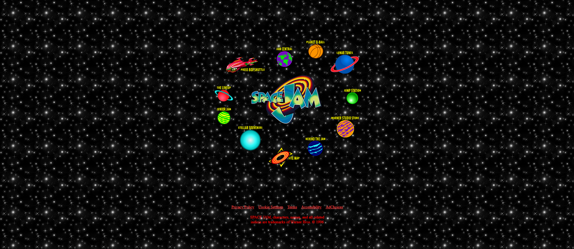
I’m down with the 90s nostalgia, but if you ever put a background like this on a website, I will hammer-spank your rear.
Same with sliders.
Fun Fact
That Space Jam website is still live. Check it out.
Your site is annoying
Web Design Mistakes // 3 of 7
Annoying is a broad category of things. But, it’s a useful guideline because you know it when you see it.
Here’s a list of things that annoy the crap out of people. Avoid these like the… well, I was going to say ‘plague,’ but we all know how that’s gone.
Basic design expectations
There are a set of basic web design expectations that visitors are accustomed to seeing when they’re online. Violating these norms means making people think. And what’d we say about that?
If your site breaks any of these basic rules, it’s annoying literally everybody. Stop what you’re doing and fix it it now:
- Artwork
- You must have a logo
- Your logo should be in the upper-left corner
- You must have a favicon
- Styling
- Your links must look like links
- Your buttons must look like buttons
- You may use a maximum of three to five main colors
- Typography
- You may use a maximum of two fonts
- Your fonts must be readable
- Navigation
- Your main navigation must be at the top of every page (except specific landing pages)
- Your logo must be in your navigation
- Your logo must link to the Home page
- Your navigation must have a search feature
- Other
- You must have a clear, above-the-fold Call to Action on all pages (more on this below)
- Your site must be mobile-friendly (more on this below)
More crap that annoys everybody
Here’s a list of things I see all the time and will frustrate your visitors, and will cost your traffic and sales.
1. Missing Home, About, or Contact pages: Every site — especially small business sites — must have all three of these pages. If you don’t, you’ll frustrate your visitors.
Fun Fact
Did you know that, in general, the About page is the second-most viewed page after Home?
2. Tasteless animations: Just because you can animate every element on your page doesn’t mean you should. If things are flying all around as we scroll down, it won’t be long before we’re flying over to a competitor.
3. Frustrating popups: Popups are still a necessary evil. They’re typically the highest-converting opt-in you can drop on your site. But, that doesn’t mean they have to annoy the piss out of us.
Should they appear the moment we land on the site? No. Should you make it impossible to find the Close button? No. Do I still see this all the time? You bet.
4. Broken elements: I’m shocked at how often I click into sites, from ads even, only to find that they have buttons that don’t go anywhere, or forms that don’t exist. You’re paying to send traffic to a page, but you’ve got a broken form!?
5. Media that autoplays: See the web design graveyard, Space Jam, and hammer-spanking above. This applies to anything that makes sound, including video.
6. Poor navigation: If your menu doesn’t have common elements (Home, About, Contact, etc.), is hard to use, or has too many levels, you’re asking for trouble. People should be able to get around your site effortlessly, and your menu shouldn’t stand in their way.
7. Garbage calls to action: “Subscribe!” No. “Join our newsletter!” Girl, bye. Apart from actual money, my email address is my digital currency. And just like cash, you need to give me a reason to hand that over. Some generic “Subscribe!” block is not that reason.
8. Forms that are too long (for no reason): I will admit that there are valid reasons for having long forms. Qualifying leads is an excellent example of one of those reasons. But, if you’re just collecting email addresses for a newsletter, Name and Email Address are all you need.
9. Hidden / nonexistent pricing: This one’s slightly controversial, but I’m a firm believer that you should always list your pricing. If you’ve got high-end pricing, your ideal clientele isn’t going to be scared away by that. And, you’ll be wasting time with anyone who isn’t willing to pay those prices. Publish your prices, or at least Starting At rates.
10. Can’t figure out how to give you my money: This one really amazes me, and it’s so common.
I’m logged in for a free trial, and I decide to buy the thing. And yet, the button to buy is nowhere to be found. I have to dig. Or search. Or both. And by the time I’ve found the spot to purchase, I’m second guessing both the purchase and my life choices.
11. Terrible images: If your images are cheesy, or unrelated to the content, or obvious stock images, you’re doing it wrong. I’m actually a user of stock imagery myself, but there’s a right way and a wrong way.
Generic photo of white people in a conference room, with a big Shutterstock watermark on it, for a post about music trends of 2016 is not doing it right.
12. Cryptologists can’t decipher that font: I can’t tell you how many Creative Entrepreneurs love script fonts. And I don’t have too much of a problem with script fonts when you can read them.
But if I have to attempt to decipher one more illegible word on one more wedding planner’s website because of a shitty font choice, I’m going to

Your clients will too.
13. Microscopes can’t see that font: 16px. That’s the smallest you should go. Nobody is squinting. Nobody wants to zoom. It’s not accessible. And, it makes us do work. >=16px.
Your copy isn’t scannable
Web Design Mistakes // 4 of 7
Speaking of things that are annoying…
Copy that isn’t scannable is a crime that’s so widespread that, while it actually belong in the next section, I decided it deserved a High Crime all its own.
I call this the Big Block of Text crime because that’s usually what it is (but not always).
Elements of scannable copy
Scannable copy for web is the enemy of everything your high school English teacher ever taught you.
The goal with copywriting for web is to make it quick and easy to read. Remember: quick and easy = more traffic and sales.
For copy to be scannable for your visitors, it should have four things:
- Short sentences
- Short paragraphs
- Familiar words
- Ample headings
Look back through this post for examples!
You’ll see that most paragraphs are 1-2 sentences. Max 3. And my sentences are quite short.
I don’t use any big words, either. We want to make this copy friendly and easy to read.
And, I use plenty of headings to allow people’s eyes to skim over the content quickly. They’ll spot things they want to read and zoom into that content while ignoring the rest. (Hint: This is good!)
Grammar rules it’s okay to break
I’m an English teacher (seriously, I taught 6-8 English). In your web copy, I give you permissions to break some grammar rules:
- It’s perfectly fine to use incomplete sentences. Just. Fine.
- And, it’s perfectly fine to start sentences with conjunctions (but, or, and, etc.)
I don’t give you permission to fuck up spelling. Or mix up stuff like to, two, and too. Get your shit together, Carol.
Making my own copy terrible, for the sake of an example
To show you how powerful using short paragraphs and headings are, I’ve taken the copy from this section and made it terrible.
See if you can figure out why:
Speaking of things that are annoying… Copy that isn’t scannable is a crime that’s so widespread that, while it actually belong in the next section, I decided it deserved a High Crime all its own. Scannable copy for web is the enemy of everything your high school English teacher ever taught you. The goal with copywriting for web is to make it quick and easy to read, not impress anyone with your use of the word “juxtapose”. For copy to be scannable, it should have four things: 1. Short sentences. 2 Short paragraphs 3. Familiar words. 4. Headings. Look back through this post for examples! Also, there are grammar rules it’s okay to break. It’s perfectly fine to use incomplete sentences. Just. Fine. And, it’s perfectly fine to start sentences with conjunctions (but, or, and, etc.).
Tell me that wasn’t harder to read. And, that you weren’t inclined to just skip it.
You skipped it, didn’t you? Yeah, me too.
Your visitors are doing the same thing with your Big Blocks of Text. Fix it.
Your copy is bad
Web Design Mistakes // 5 of 7
Even if you’ve avoided the Big Block of Text crime from above, there are still plenty of ways you can fuck up your copy.
Then, your fucked-up copy will cause me to go out of my way to be like

Things to avoid so we don’t ^ at your copy
Alright, real talk. Here are five things to watch out for as you write.
1. Copy is jargon-y: The fastest way to sound like an idiot is to try sounding smart. If you load up your copy with jargon — big, fancy, and often meaningless words — you’re asking for trouble.
We’ll roll our eyes at you, bounce out, and drive up your bounce rate.
2. Copy has grammar, spelling errors: To, too, two. There, their, they’re. Your, you’re. It’s, its. Then, than. Affect, effect. Could have; should have.
These are just a few examples of common mistakes that grown. ass. adults. should not. be. making.
We covered this briefly above. But, I reiterate: Get your shit together, Carol.
Incidentally! If you want help getting your shit together Carol, I’m actually a phenomenal copywriter and copyeditor! And, I’d love to help you out (as long as you can put up with the tiniest bit of sass…)
This will be a formal service I offer soon, but for now, shoot me a note on the Contact page and let me know. I’m happy to help, and I charge reasonable rates!
3. Wrong amount of copy: I used to tell this to my middle school English students when they asked how long their papers had to be: as long as they need to be. You need to use enough copy to get the message across and then stop.
Too little = confused visitors full of questions. Too much = confused visitors full of questions (+ unread copy).
4. Copy is irrelevant: Not only is it fine to inject some personality into your site, but it’s welcome, and it often helps visitors connect with you on a human level.
What’s not welcome though is to go off on long, unrelated, cringey tangents about your personal life that leave us running for the key to the liquor cabinet. Unless that somehow helps your visitors convert..?
Otherwise, delete, delete, delete that irrelevant copy.
5. Copy is contradictory: I was conducting a site audit for a wedding planner. Everything about her site, from branding to colors to fonts to copy screamed Typical Wedding Planner.
And, that’s perfectly fine! If you booked her, you knew exactly what you were getting, from color palette to events to venues.
But! The problem was that she kept saying — over and over — that she planned “unique” weddings.
Perfect example of contradictory copy. Don’t do this.
Your site doesn’t have one clear goal
Web Design Mistakes // 6 of 7
I think a lot of Entrepreneurs are confused about the primary purpose of having a website.
If you’re one of those poor, confused souls, let me clear that right up for you: It’s to make money.
Sure, there are lots of secondary purposes, but your website is just an arm of your business. And so, if it’s not generating revenue, it’s costing you resources.
With that in mind, another High Crime I often see is not directing visitors toward an action that ultimately gets them to spend money.
You need a Primary Call to Action (pCTA)
Let’s break that down.
Pri·ma·ry (adjective): of first rank, importance, or value.
Call to Action (noun): a piece of content intended to induce a viewer, reader, or listener to perform a specific act.
In other words, your pCTA is the most important action you want your visitor to take while on your site.
Most important.
Most. Important.
Most.
“But I have three things I want—”

By definition, “most” is ordinal, meaning just one thing comes first. It can never be more than one thing.
So, if you’re not clear about what one action is most important for your visitors to take, not only do you deserve a mean, cold slap, your visitors will be unclear about it as well.
To find your pCTA, answer this question:
If my visitor could click only one thing on this page, what would I want it to be?
Pro Tip
Your pCTA should be the action that helps drive the most sales.
Mistakes I see with Primary Calls to Action
I see the same few web design mistakes with pCTAs over and over:
1. Your pCTA isn’t above the fold: This is the big one.
“Above the fold” is an old newspaper term.
Papers are often displayed to customers folded so that only the top half of the front page is visible. That’s the location where the most important stories were printed: Front page, above the fold.
The term has been ported over to the internet world, and now it means the area that shows up when a site first loads without scrolling.
Your pCTA must be in this area.
Pro Tip
Your pCTA shouldn’t only be above the fold. It should be all over your site, too.
2. Your pCTA styling is inconsistent: We’ll talk a bit more about this in the next section, but I highly encourage you to keep your pCTA styling consistent throughout your entire site. If you decide it’s a blue button with white text, keep it a blue button with white text everywhere.
Also, nothing else should use that styling except your pCTA!
3. Your pCTA isn’t in your header: Okay, this one isn’t that big of a crime. But! It’s still a good idea to put your pCTA in your header. That way, it’ll always be easily accessible to your visitors regardless of where they are on your site.
But what if I do have multiple Calls to Action!
I never said you couldn’t have more than one Call to Action.
I said you couldn’t have more than one Primary Call to Action.
The way I recommend dealing with multiple CTAs is simple:
- Style your Primary Calls to Action one way
- Style the rest of your Calls to Action another
For example, at the time of writing this post, the C&G site is somewhat under construction. But! My pCTA is to drive folks to contact me for paid web help.
So, any version of a CTA that pushes people to contact me for service, you’ll notice the button is a solid red button with white text.

Any buttons that lead folks to do other things? They’re not solid red with white text.
(That’s a button for getting free help, not paid help. It’s not my pCTA!)
Pretty soon, this pCTA will change, but you get the idea.
Example Calls to Action
Generic calls to action are garbage. We talked about generic “Subscribe” bullshit above, remember?
CTAs with copy like “Click Here” fall into this category too.
Here are some better examples:
- Try For Free
- Book a Free Consultation
- Book Now
- Download the PDF
- Start Here
- Start Your Free Trial
- Go Premium
- Grab the Free Worksheet
- Get Started for Free
- Shop Now
- Compare Features
- Download Now
Your site doesn’t work on mobile
Web Design Mistakes // 7 of 7
Alright, last one. Doesn’t mean this is any less important, though.
In fact, a mobile-friendly site is probably the most important factor here.
If your site doesn’t work on mobile, Google will hate you. Visitors will hate you. I will hate you.
…well, maybe I won’t hate you. But I will tease you a bit.
Back in 2016 was when mobile usage surpassed desktop, and its share has only grown since.
Optimize your site for mobile. Period.
Do Mobile QA every time you publish a new page or post
QA stands for Quality Assurance, and you should be running everything you publish through a Mobile QA process.
All that means is, once you publish a post or page, pull it up on your phone, scroll through, and make sure everything looks alright.
Things to check for include:
- Load time is good
- Typography looks right (especially font sizes)
- Everything fits on the screen (nothing hangs off the left, right edges)
- Everything is legible
- Links work as expected
- Clickable things are big enough
- Space between things looks right
Mobile QA will add on an extra 10 minutes to my workflow, but as more than 50% of my traffic (and, likely, your traffic) comes from mobile, it’s so worth it.
Others? Questions?
Any thoughts or questions? Anything with which you disagree? Anything I missed?

0 Comments